I love this entry way with all of the Hermes boxes; can imagine how much stuff you would have to purchase from Hermes to accumulate this many boxes?!
This living room designed by Diane Bergeron is so stunning - I love how clean and symmetrical the whole room is.
This is such an adorable kid's room; I love how the designer mixed so many patterns: inter-locking circles, horizontal lines, vertical lines. and that giraffe law, how cute!!!
Such a great idea- framing the sunburst mirror over the fireplace with the white border. Also the color of the walls is so bold and refreshing.
This room designed by Ken Fulk Designs as featured in House Beautiful is such a fun room for a little boy.
This picture and the next three were featured on Style at Home and the couple was inspired by the lake, sun and sky in decorating their Lake Simcoe cottage. I love the piping details on the upholstered furniture, and that backyard- that is killer!

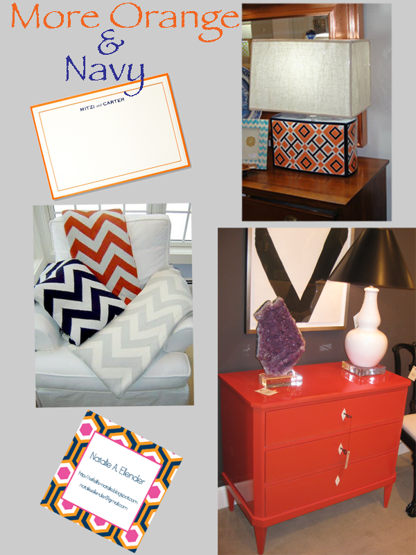
My obsession with orange and navy started last year when I saw this Jill Rosenwald lamp at Antique Exchange in the Hampden area of Baltimore. I Love the geometric pattern, it reminds me of the Tory Burch shopping bags. The navy/orange combo on the stationary by Vera Wang is gorgeous- I think this is going to be my new stationary. The chevron striped blankets are so adorable and cozy. I ordered these calling cards from Rock Paper Scissors and I Have received so many compliments on them. I know that this picture of the chest does not have any navy but I just had to include this awesome tangerine chest from Festoni that I saw last April at High Point Furniture Market. I am going next month with my mom and I can't wait to check out their showroom.


I love these photos! Especially the ones from Style at Home...I'm about to have some vintage chairs reupholstered and piped and discovered your blog while searching for images...the navy/white combo is really quite lovely! And so is your blog!!
ReplyDelete