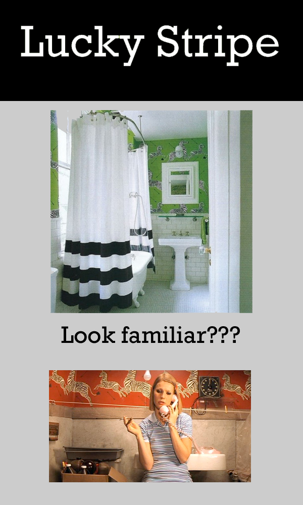
So it seems that I like wallpaper more than I led you to believe. I absolutely love this Zebra print wallpaper by Scalamandre as seen in Kate Spade's bathroom. The white, green and black in this bathroom contrast with each other so much, but it just seems to work. I also really like how only half of the bathroom is papered because of the white subway tile, which keeps it from being overkill. And for those of you who thought it looked familiar, that's right! It was used in Wes Anderson's The Royal Tenenbaums. But this paper has actually been around for a while,
Scalamandre’s iconic Zebra pattern dates to late 1930s New York, premiering at Gino’s restaurant on Lexington Avenue. Flora Scalamandre designed the art deco wallpaper especially for its shoe-boxed sized premises, stying zebras with arrows representing a hunt. Its striking contrast of black and white zebras on red background proved a hit. Later, the design was offered with alternative green, yellow and brown background hues. Quixotically, the original screen cutters forgot to engrave a stripe on the rear leg of the smaller zebra. A conscious decision was made to retain the missing zebra stripe to this day.
Looks like the Asuka wallpaper by Osborne and Little has some competition!


No comments:
Post a Comment